Memocorp
-
ClientMemocorp
-
Year2022
-
ServicesBranding
-
Website
The Challenge
Memocorp’s parent brand and sub brands had drifted apart, and there was no shared guidance on how to use them. Internal teams and external partners were each reading the brand their own way, so the audience got mixed messages.
The Approach
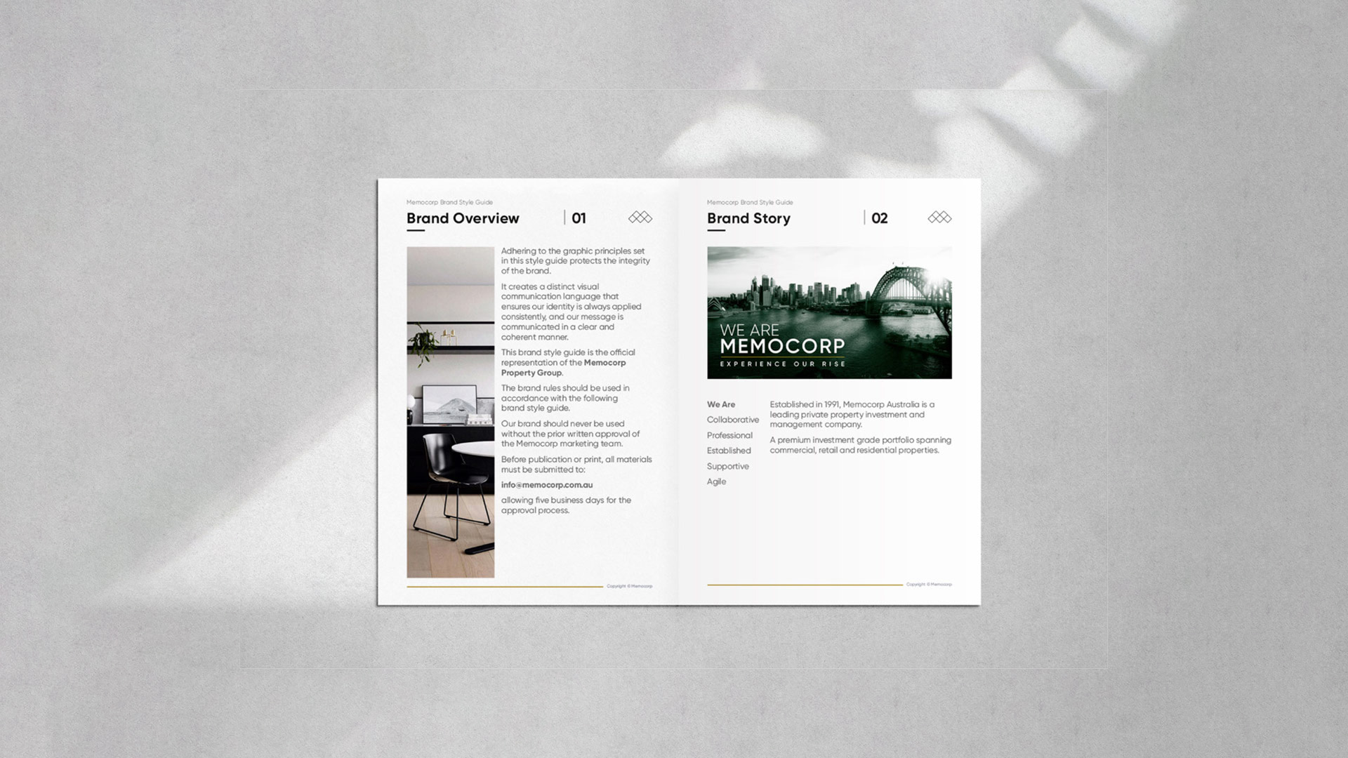
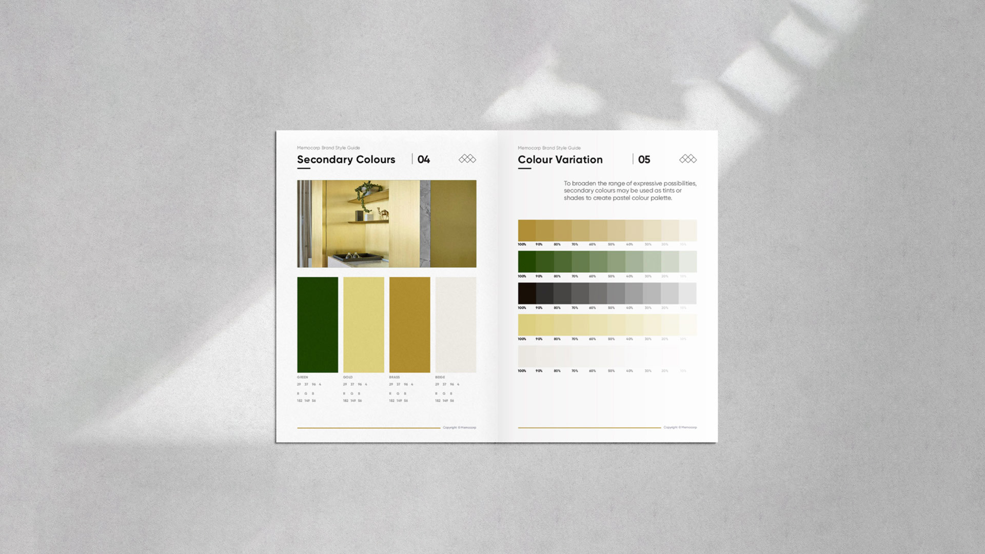
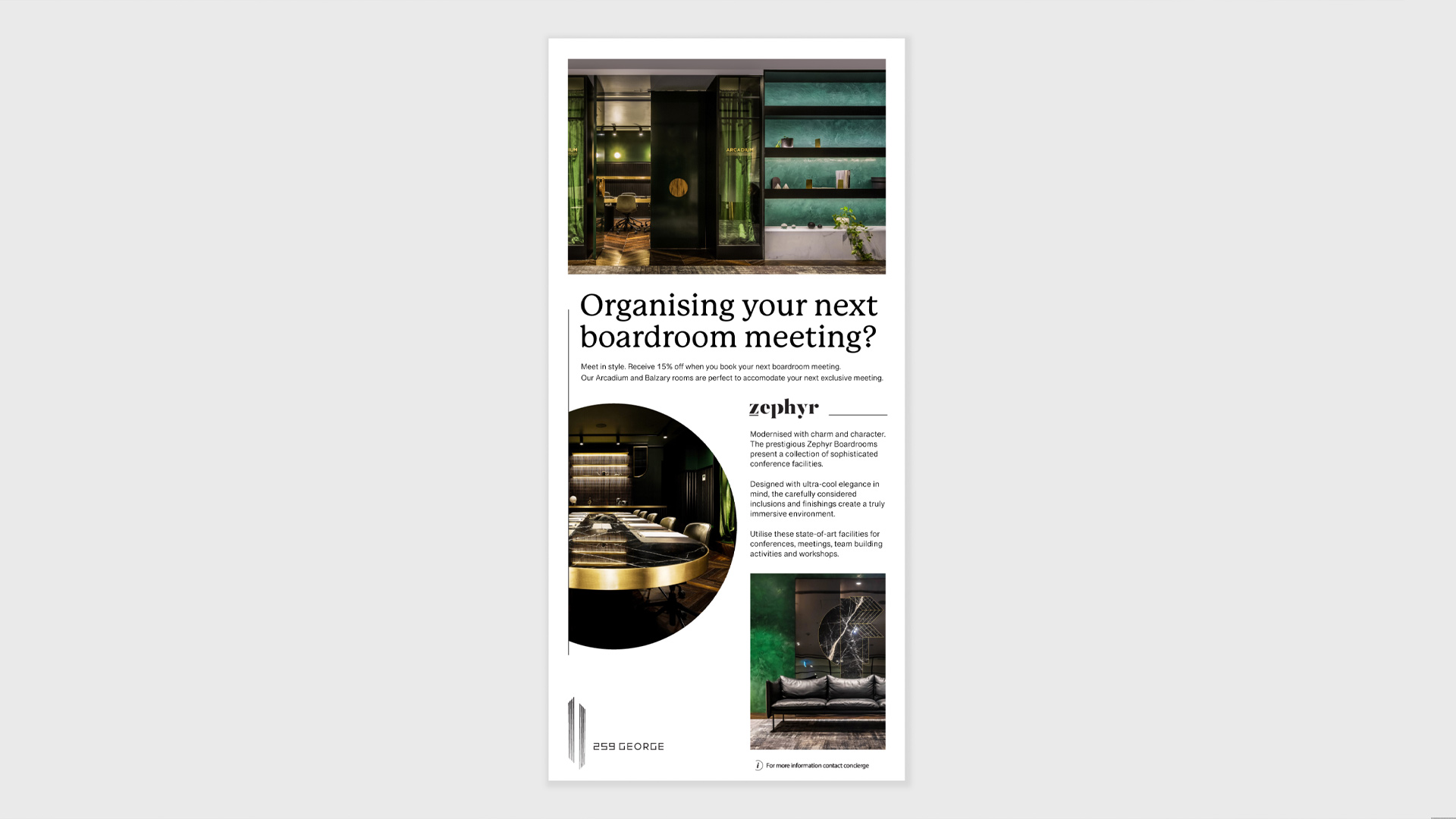
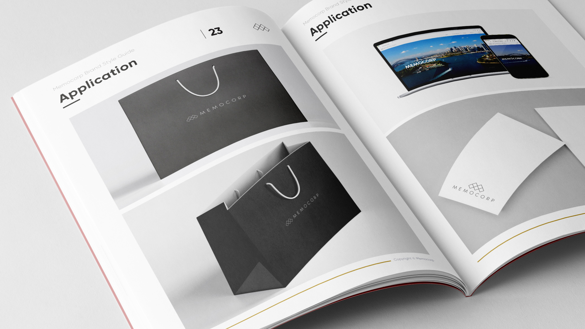
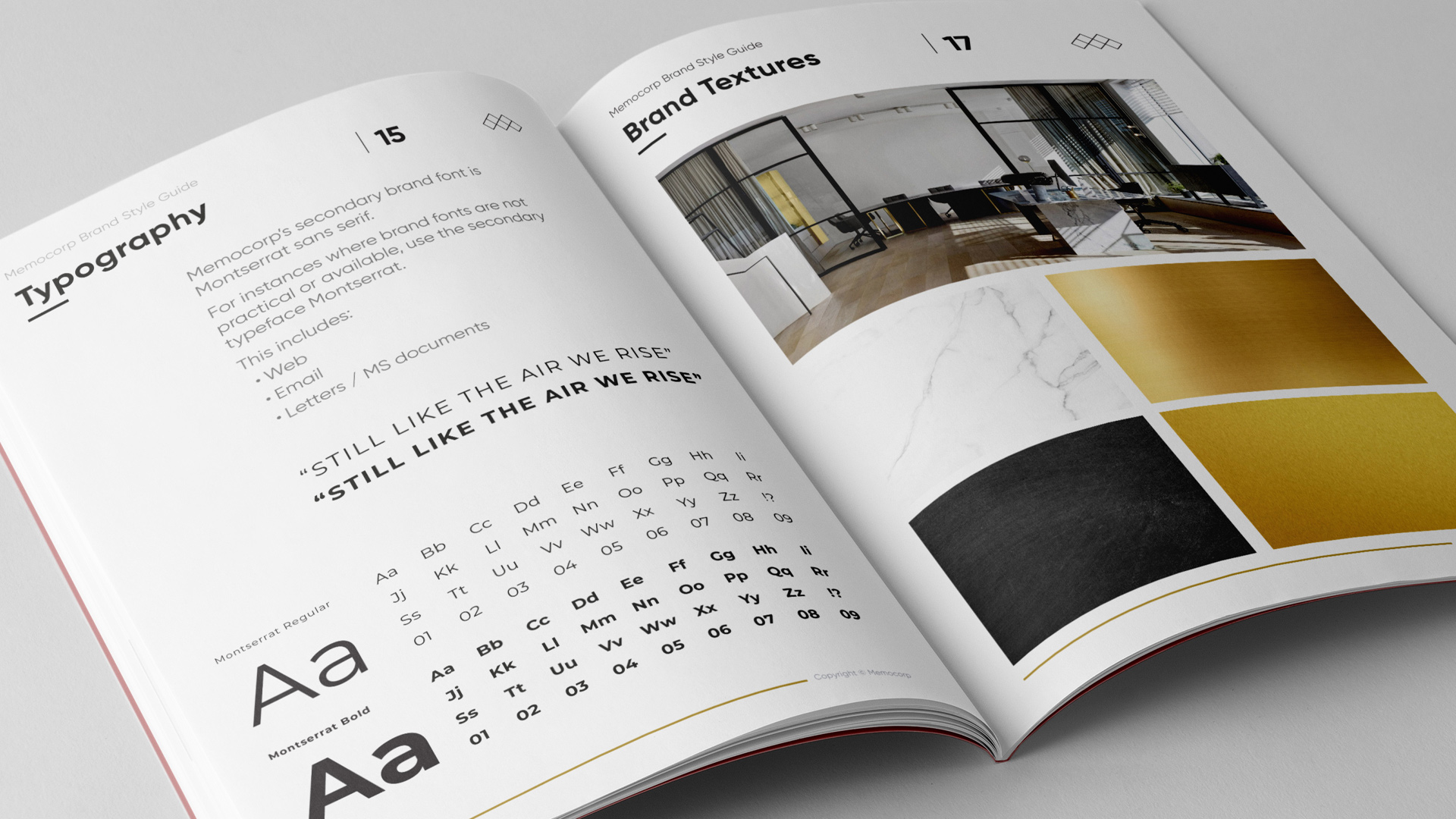
Over a four-month contract, I designed and developed comprehensive brand guidelines and a style guide that define Memocorp’s visual language, from colour and typography to layout. The guide gives each sub brand a clear place within the wider family. I then worked with the internal team to put the rules into practice, so the brand is applied consistently across every material and touchpoint.
The Outcome
One connected brand family that speaks to its audience with a clear, consistent voice.
About
Senior graphic designer and brand creative with over a decade of experience across branding, content, photography, packaging, print and digital, from concept through to final production.
Contact
Sydney, Australia
© Jon Saroglu / All rights reserved